TrimmicBrand Identity
Overview
When Trimmic decided to brand itself, the brief was simple: build something impossible to ignore.
Creative studios often fall into the trap of looking like every other creative studio: safe palettes, generic marks, forgettable typography. Trimmic needed an identity that embodied what it actually does: make brands that don't sit quietly in the corner.
The result is a visual system built around energy, confidence, and play. A brand that's as bold on a 30-foot billboard as it is on a business card. Unmistakably, unapologetically Trimmic.
01 · The Mark
A mark that moves
before you do.
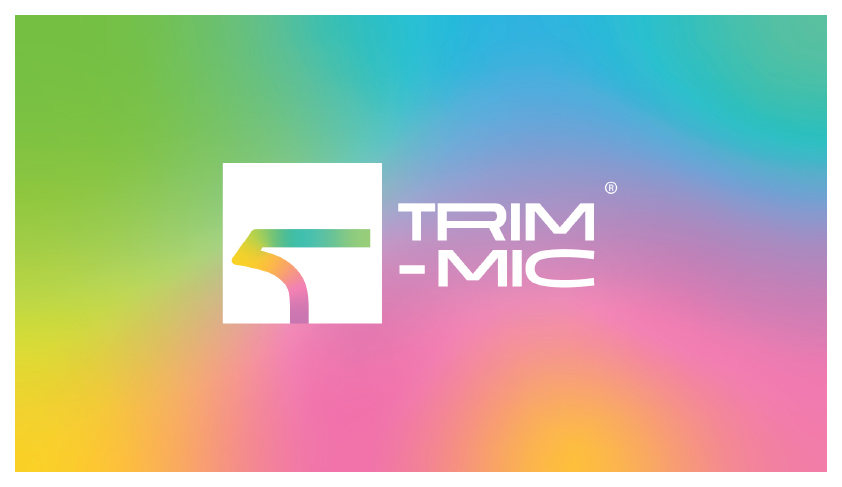
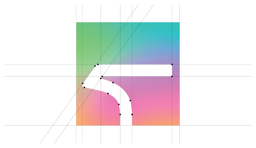
The Trimmic 'T' mark is a fluid, forward-leaning symbol, built on precision but designed to feel alive. The letterform suggests momentum: always moving, always creating, never static.
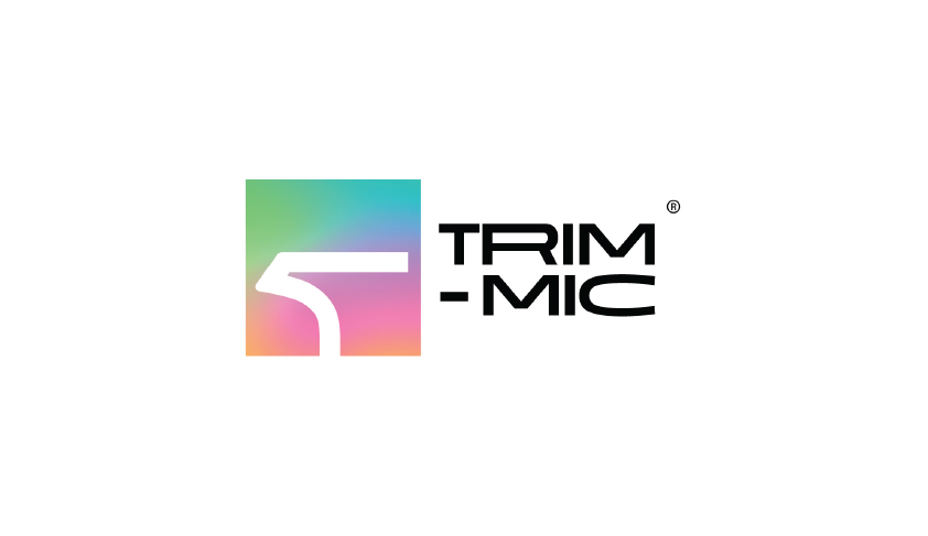
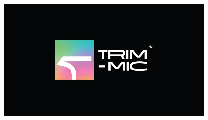
Three logo variants (on white, on black, on gradient) give the brand total flexibility across every surface and context, from digital screens to physical environments.
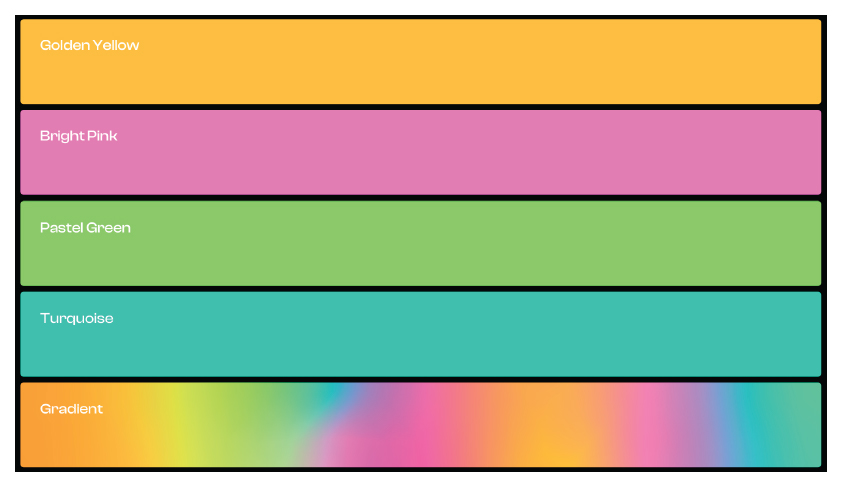
02 · Color System
Four colors.
Infinite combinations.
03 · Typography
Type that
speaks volumes.
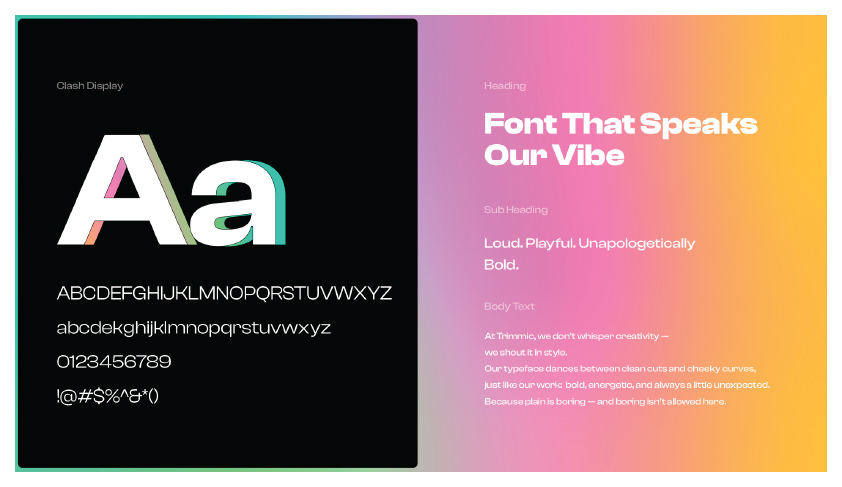
Clash Display anchors the brand's voice: geometric, confident, unapologetically bold. Paired with Instrument Serif for moments of personality, the typographic system handles everything from a tiny label to a 10-metre billboard headline.
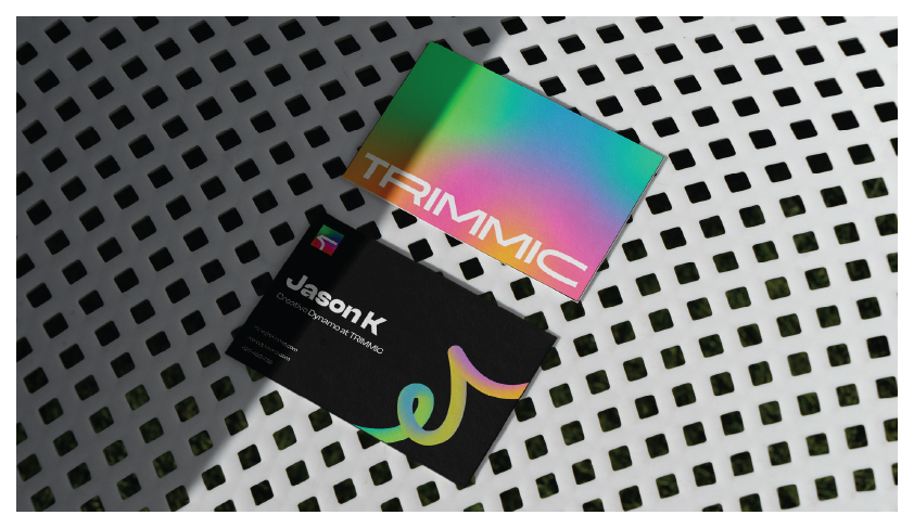
04 · Brand Collateral
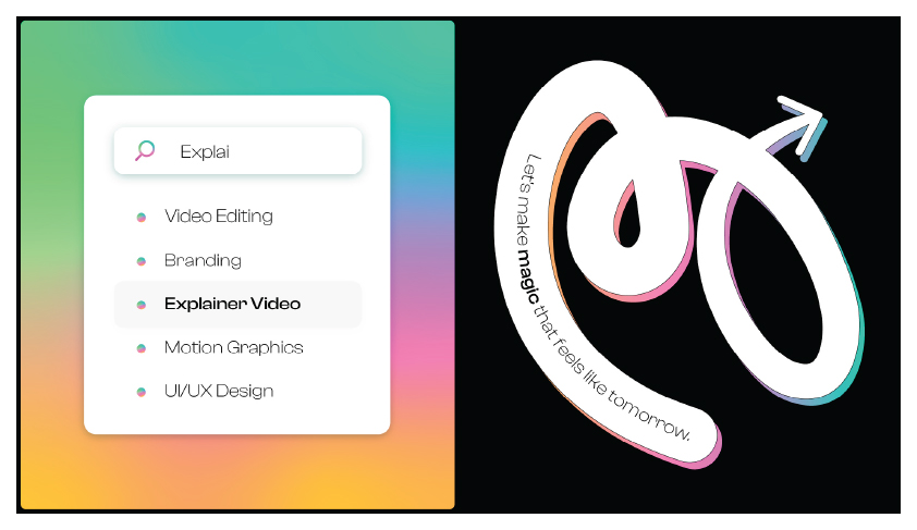
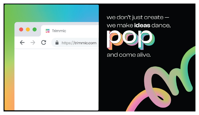
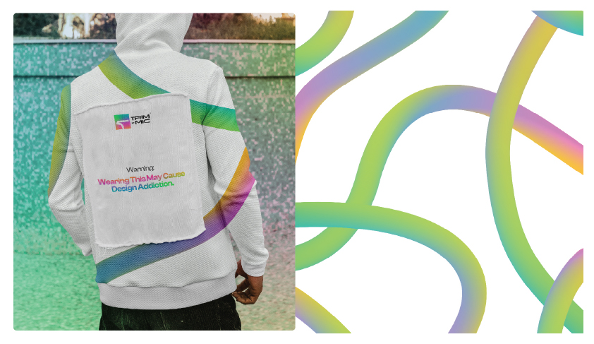
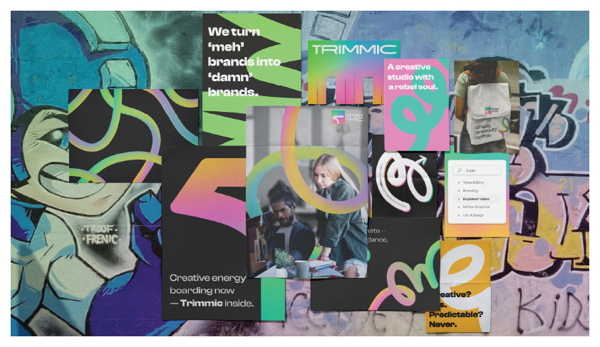
Every touchpoint,
unmistakably Trimmic.
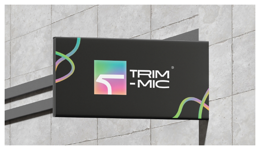
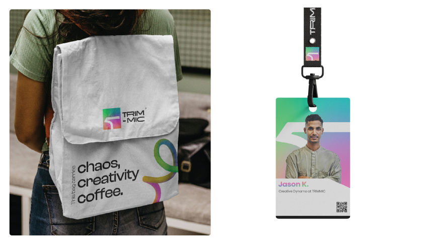
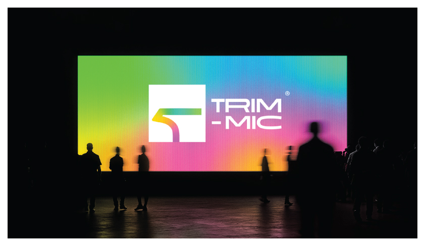
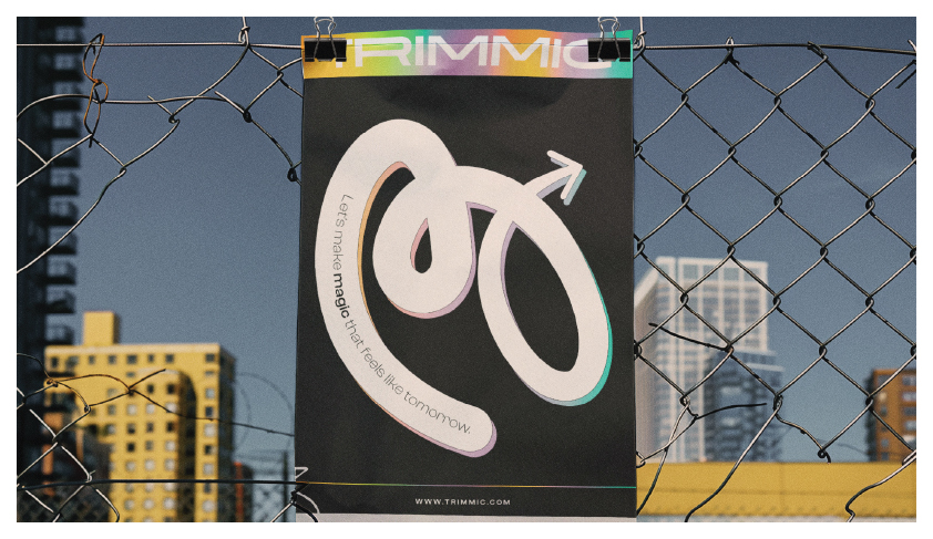
05 · In the Wild
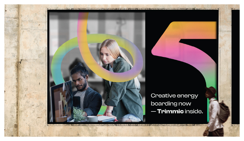
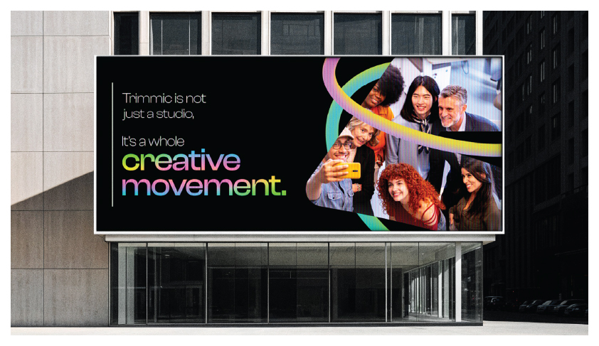
Built for the real world.
Designed to own it.
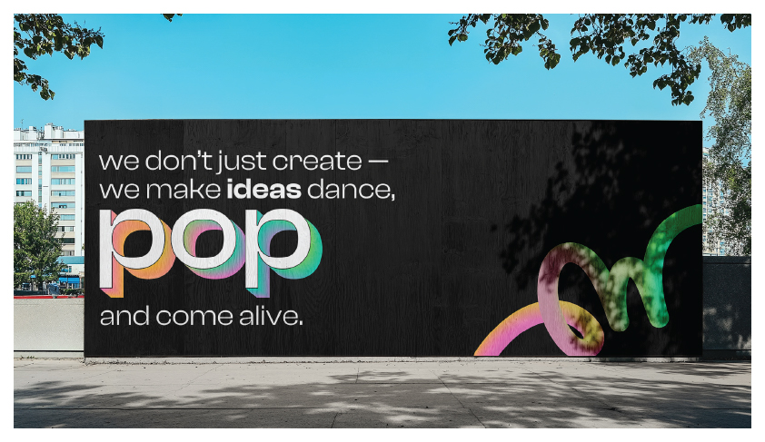
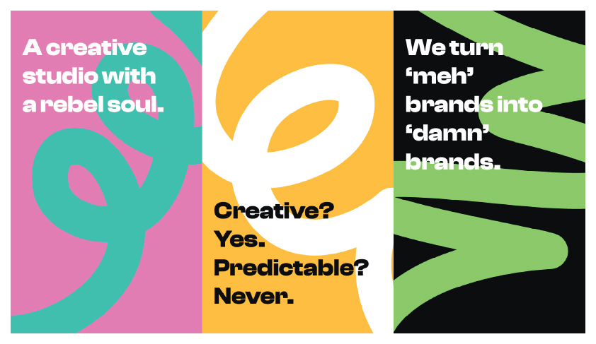
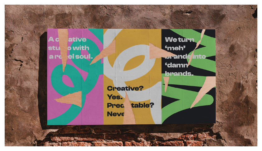
06 · Results
A brand that works
as hard as we do.
The Trimmic brand identity launched across all digital and physical touchpoints simultaneously: website, social media, business stationery, signage, and merchandise. The system scaled from a favicon to a 30-foot LED screen without missing a beat.
More importantly, it gave the studio a voice that actually sounds like it. Not a brand that plays it safe. A brand that plays to win. Bold, cohesive, and ready for whatever comes next.
Want a brand this bold?